Fortunately the cathedral wants to shed this logistically bizarre floor plan. Unfortunately, the new design chooses to downplay the building's heritage and go as modernist as possible. The church's cylindrical shape will take precedence, with simple chairs and a minimalist altar playing an understated supporting role.
 |
Rendering of the proposed St. Hedwig redesign.
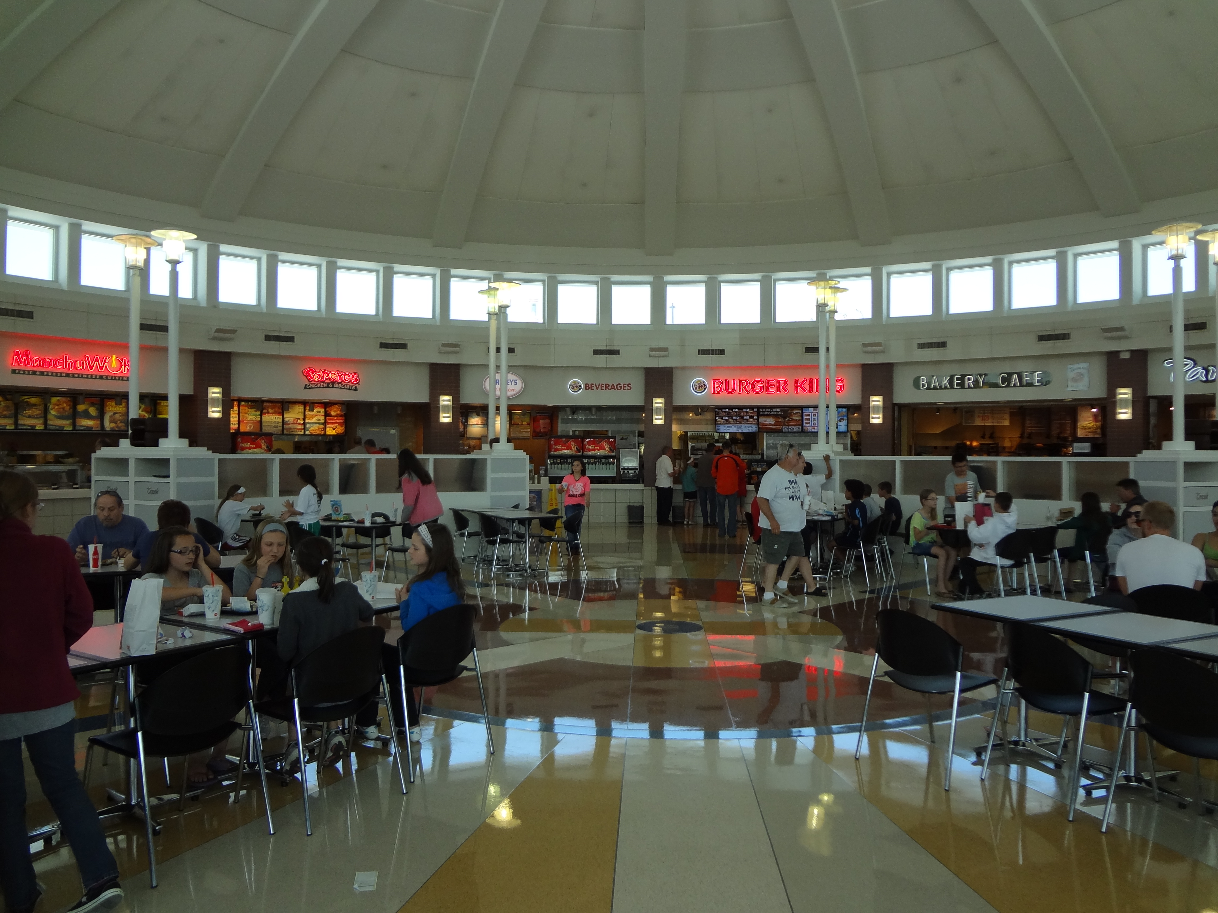
Trash bins for your Burger King wrappers are located on the perimeter. |
The
parish near my college had a very similar design. It wasn't terrible; the building was bright, airy, and impressive. The altar was indeed the focal point. But it also felt cold and cavernous sitting under so. much. white. My guy friends called it "The Mothership." I couldn't help comparing it to these
highway rest areas on the Ohio Turnpike, which at least jazz up their floors with contrasting tile colors.
 |
| "Our Lady of Blessed Acceleration, don't fail me now!" |
So yeah, based on my own liturgical experience this is not my favorite scheme. I'm confused by some of the Berlin plan's catchy descriptions.
"The floor remains a visible and palpable constitutive, fundamental element of the architecture" How? Because it's there? Sure it's ubiquitous and essential, but so is the cement in your garage.
"Unlike in rigid rows, one can look around the circle of the gathered community in which one feels secure." Yes, that's exactly why I love making eye contact with the people across my subway car. It makes me feel so secure!
This isn't to say that church decorative styles can't progress past the 19th century, though. Fr. Dwight Longenecker recently wrote a very nuanced view of modern design in
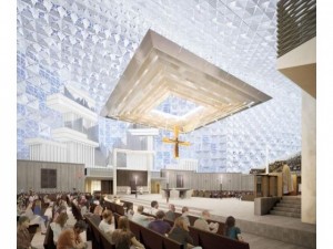
his assessment of the plans for California's Christ Cathedral. He pointed out that "the problem with traditional churches is that they can sometimes be no more than copies of earlier churches." Modern churches often deny continuity with the past, but that doesn't mean we can never leave the past, either. I especially liked his hypothesis that medieval Gothic architects would have gladly used steel beams if that material had been available to them. Praising the clean lines of Christ Cathedral's floating sanctuary canopy, he notes that it would certainly "be wrong to plonk down a baroque altarpiece or a gothic pulpit" in such a modern space.
 |
| Rendering of Christ Cathedral sanctuary. |
This mis-matching of styles is sometimes an occupational hazard of traditional piety revival. Just as you wouldn't put a geometric Matisse painting in a gold rococo frame, you can't just slap more gilded columns on a modern church and call it a day.
 |
Niagara University alumni chapel, above.
Divine Mercy parish, below. |
For example, I ran into some interesting architectural combinations last weekend on the first leg of my Three Weddings and a Conference trips. First stop was the
alumni chapel at Niagara University. This historic church at a Vincentian school blended old and new very well. You could tell which stained glass windows were from the 19th century and which were post-Vatican II, but there was still subtle continuity. The glass rood screen separting the main sanctuary from the smaller daily mass area was obviously a recent addition, but it featured traditional iconography of the four Evangelists and scenes from scripture. Sitting in its "rigid rows", I still felt secure and inspired, and not just because my friend was a gorgeous bride.
The next day I ventured to the parish closest to our hotel that fit our traveling schedule. It was a typical 1980s generic church design, with exposed brick, angular stained glass saints, and that wood beam tent/barn ceiling that was popular for a decade or so. The funny unexpected twist was the abundance of traditional devotional items scattered all around. These were probably inherited from a nearby parish that closed. It's great that these sacramentals still have a home, but boy, was it jarring. Pastel baroque curlicues do not mesh well with big blocks of brown and primary colors.This was one time where a little modernist restraint would have helped.
Most interesting were the huge paintings hanging in the sanctuary, dating to the 1950s. One depicted the Holy Family, and the other showed the Catholic version of the Cleavers praying the rosary in their living room. It was a great piece of American Catholic material culture, but it clashed with the building overall. Thanks to the blinding morning sunlight coming through the windows, my little iPhone camera couldn't capture a good image of the paintings. In this mash-up of competing decorative styles, the best of both worlds got drowned out.


Some time ago, I took up taking photographs of regional churches as sort of a hobby. I travel quite a bit, and I like church architecture, and architecture in general, so I started taking photographs of churches and courthouses (and sometimes simply buildings), and posting the photos on a series of blogs.
ReplyDeleteIn doing that, I'm afraid that as much as I like Father Longnecker, I've come to the conclusion there's something really special and reverent about traditional church design, and indeed, the theological outlook of a certain location can even be reflected in the church design. "Modern" churches, while some are nice, are often just sort of odd appearing after some time passes following their initial construction and novelty.